
Homeleom
/ Inspiring with design
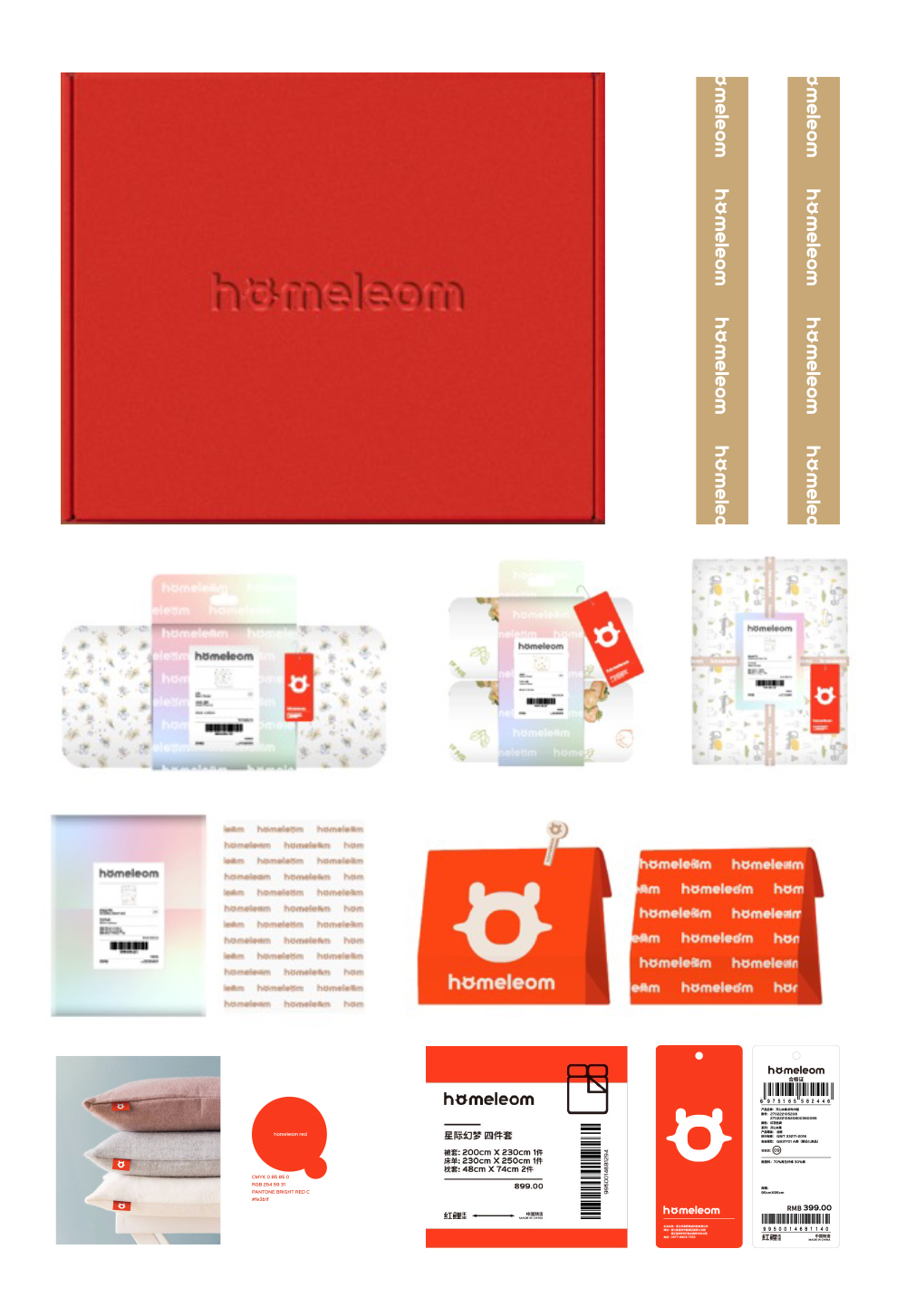
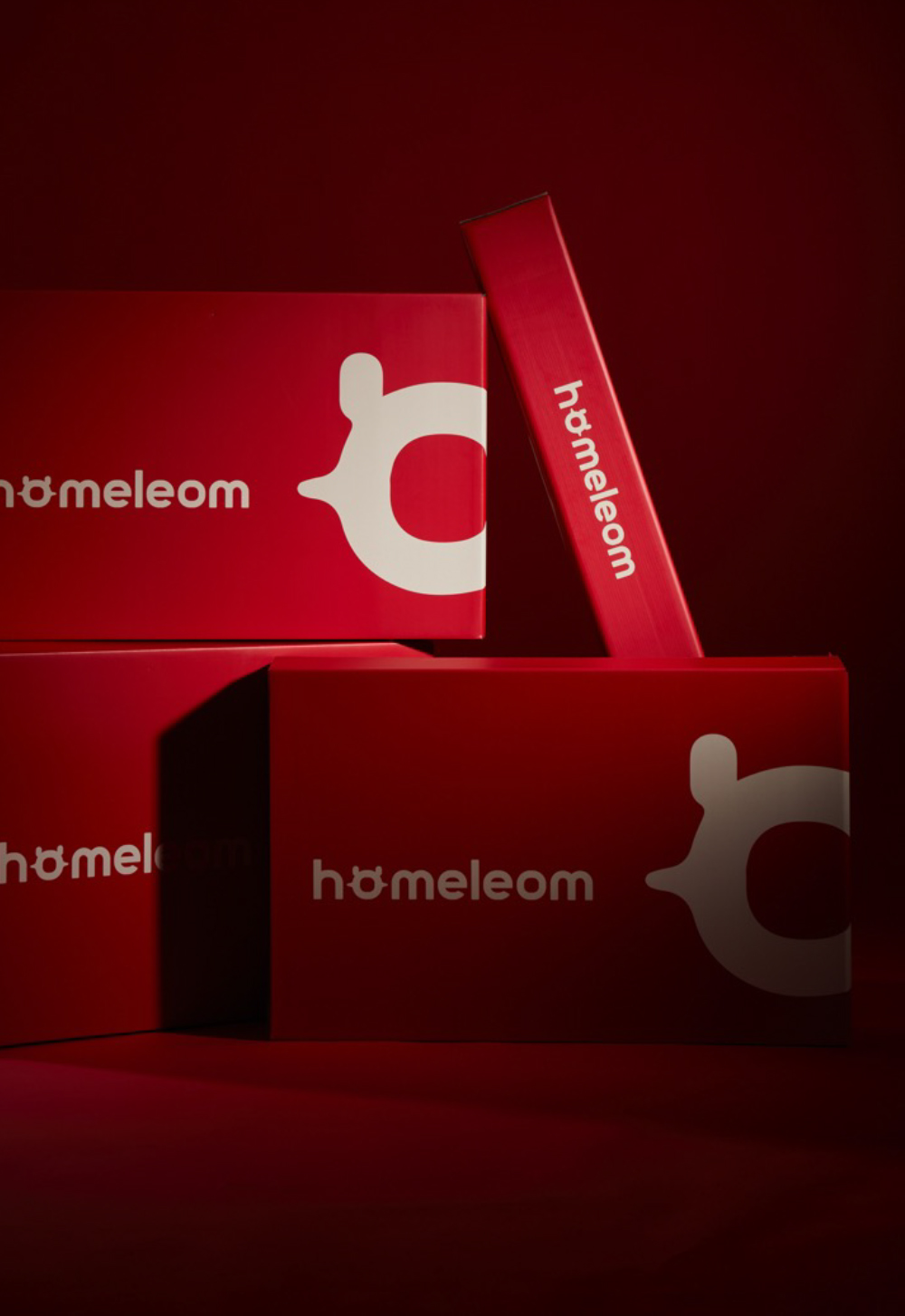
Homeleom红鲤乐团以品牌英文名读音谐音而衍生出的,与家和吉祥寓意相关的“红鲤”形象, “鲤” 与 “礼”同音,代表着品牌以礼的方式,打造“礼享梦宇宙”的产品理念,借助礼的产品让小家伙们爱上自己的家。
Homeleom derives its "Red Carp" image from the homonym of the brand's English name, which is associated with home and auspicious meanings. "Carp" and "Li" in Chinese are homonyms, representing the brand's approach to creating a product concept of "Dream Universe" through a ritual, with the help of rituals to make kids fall in love with their home.
O图形超级符号
/ Inspiring with design
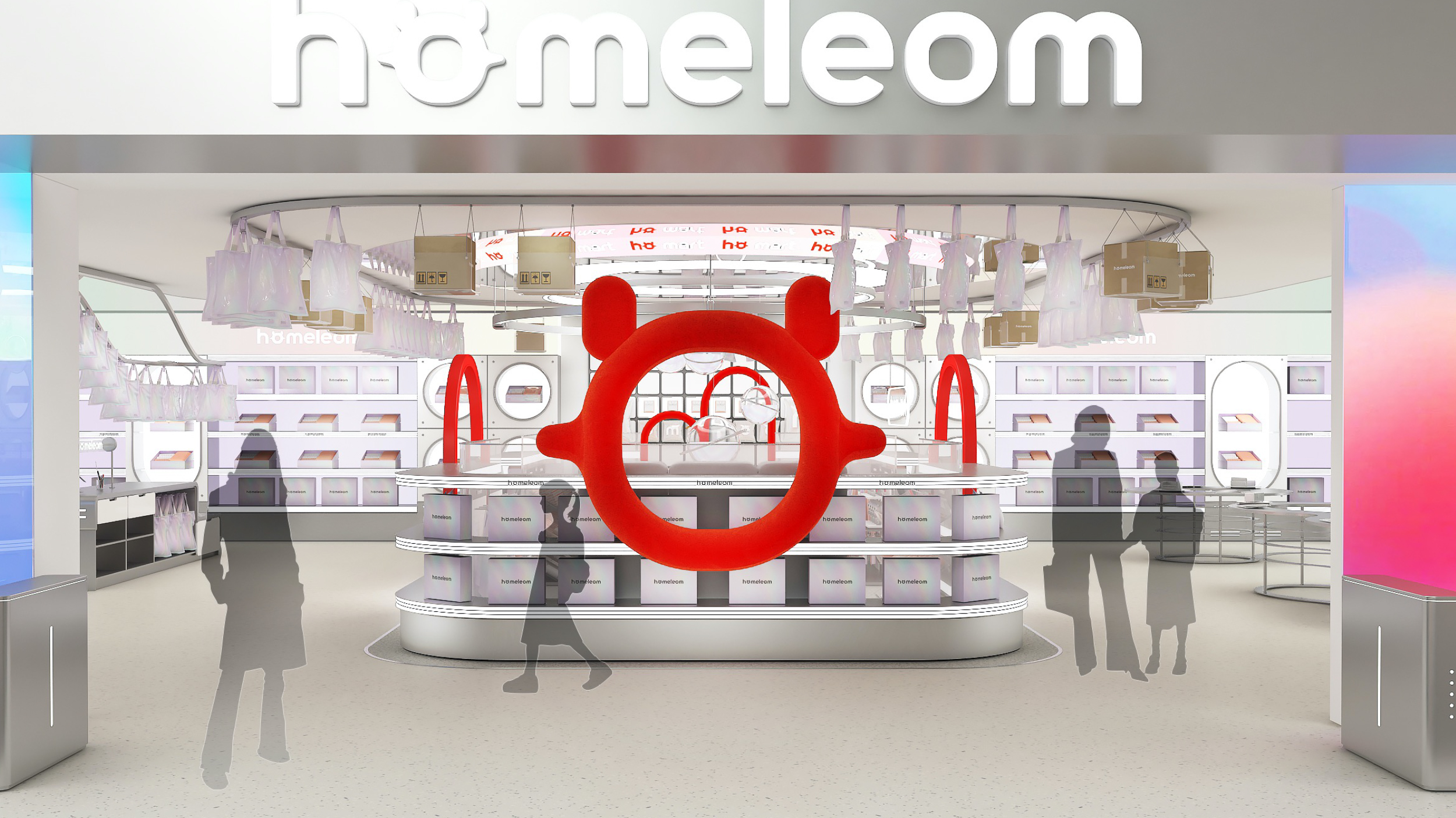
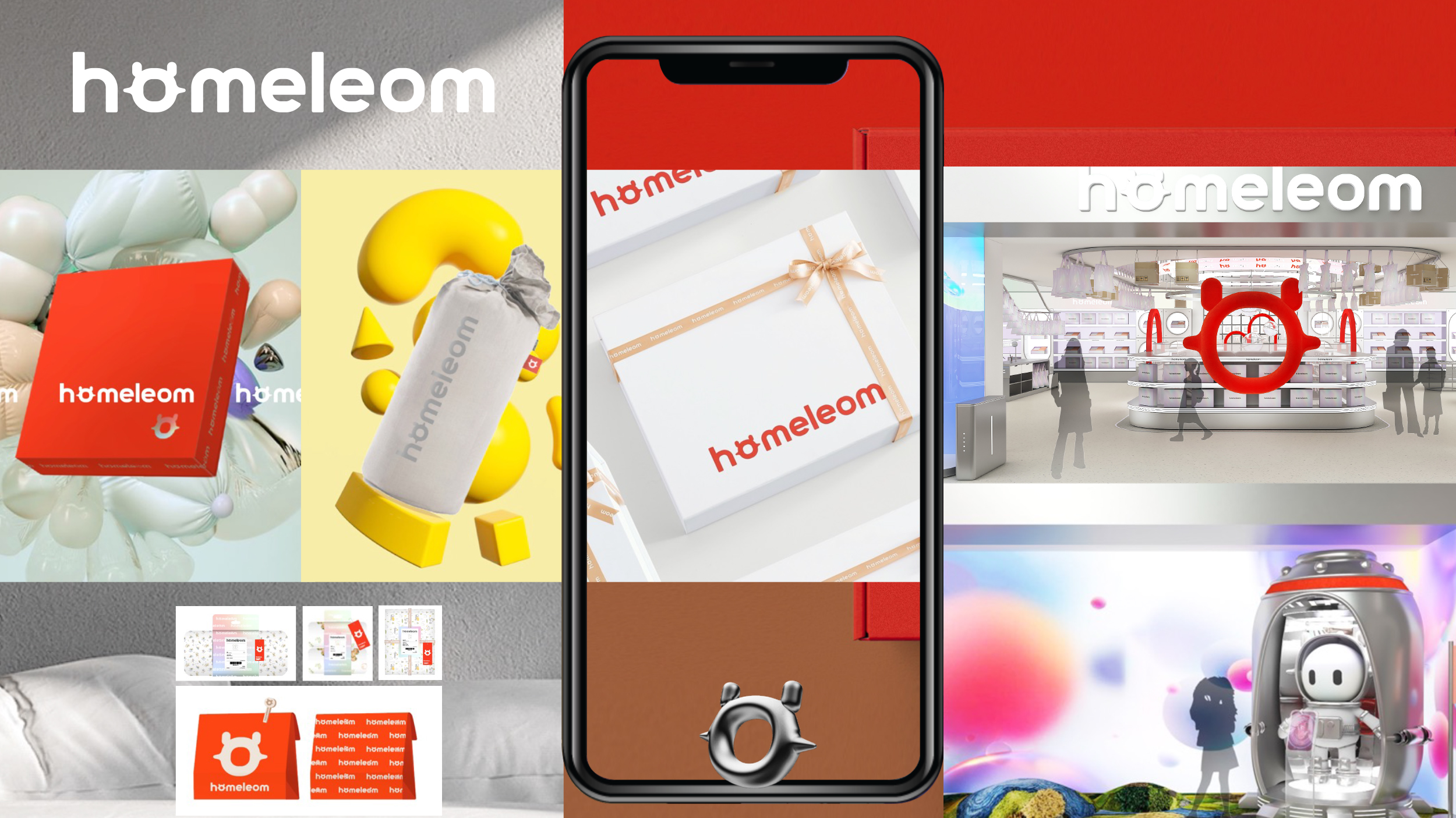
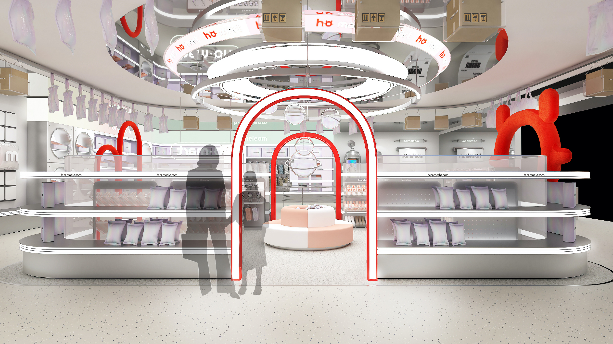
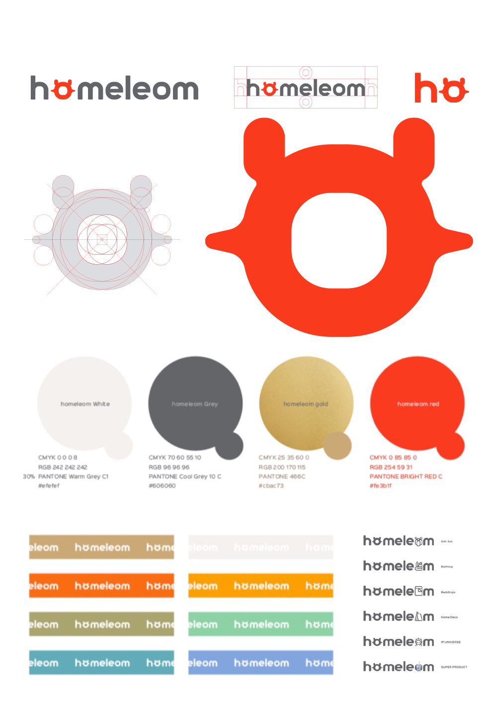
ATOM为品牌创造的O图形的形状蕴含着发髻中国娃娃的外形、鲤鱼的鱼嘴形状、以及宇宙星球的形状三重含义,合一成为。一个简约现代的联想丰富的图形,将会成为homeleom品牌的超级记忆符号,沿用在品牌推广/产品以及产品包装/渠道销售物料中,强化品牌的视觉识别度。
The shape of the O-shaped graphic created by ATOM for the brand embodies the three fold meaning of the shape of a Chinese doll with a bun, the shape of a carp's mouth, and the shape of a cosmic star, integrated into one. A simple, modern, and richly associative graphic will become a super memory symbol for the homeleom brand, and will be used in branding / product promotion, as well as product packaging / channel sales materials to enhance the brand's visual recognition.